Level: C1
Reading | Vocabulary | Activities | Speed Challenge | Shadow Reading and Typing | Questions | AI Prompts | Discussion | Language Focus | Resources
Printable: Student handout (PDF) | Teacher’s key (PDF)
Reading
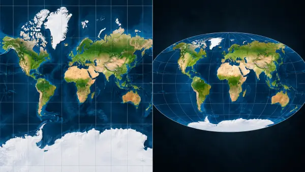
Picture the world map on a classroom wall. Greenland sprawls across the top, looking almost as large as Africa, and nothing about the picture seems wrong, because most of us grew up with maps like it. Yet Africa covers roughly 30 million square kilometers, about fourteen times the area of Greenland. The island looks enormous only because of the way the map was drawn, and that choice has a history worth knowing.
The cause is stretching. A globe cannot be pressed flat without some distortion, much as an orange peel splits if you flatten it on a table. The Mercator projection keeps the lines of latitude parallel and stretches the map more and more toward the poles. Near the equator the stretching is mild. At 60 degrees north, the latitude of Oslo and Helsinki, areas are drawn about four times too large. Greenland lies so far north that the effect inflates it by roughly a factor of ten. If Greenland were drawn at its true size, it would look only slightly larger than Mexico.
None of this was a blunder. In 1569 the Flemish cartographer Gerardus Mercator published a large world map whose Latin title says it was adapted for the use of navigators. It was designed for mariners. On a chart drawn this way, a captain could plot a course with a ruler, because a straight line crossing the meridians at one angle matched a single compass bearing that a ship could follow. If you were a sixteenth-century captain, you would find this astonishingly practical. Mercator also knew the price. His own notes on the map explain that the degrees of latitude had to be stretched toward the poles.
The price was size. Every flat map is a trade-off, because no map can keep shapes, areas, and distances correct everywhere at once. Mercator protected directions and angles and gave up area, a bargain for ships, and sea charts are still commonly drawn this way. The trouble began when the same picture moved onto classroom walls and, in a modified form known as Web Mercator, into online mapping after Google Maps adopted it in 2005. It became the default, the map you get unless somebody chooses another. Over generations the habit grew entrenched. In 2018, Google Maps on desktop began showing a globe when you zoom far out, which quietly shrank Greenland back to its true size.
Critics have long argued that the habit skews how people see the world. In the 1970s Arno Peters promoted an equal-area map and claimed that the Mercator picture favored colonial powers. Map historians replied that a Scottish clergyman had devised almost the same projection more than a century earlier, and that it stretches shapes badly. Boston’s public schools made headlines in 2017 by switching their classroom maps to it, and some historians were openly critical. No flat map can sidestep the problem. If a map kept every area accurate, the continents would look warped, and if it kept every shape, the sizes would drift.
Whether Mercator’s long reign reflected prejudice or simple convenience is contentious, and Mercator himself was working for sailors, not for schools. The legacy, however, is easy to see: Europe, Russia, and Canada loom large, while countries near the equator look smaller than they are. In 2025 the African Union backed #CorrectTheMap, a campaign run by two organizations, Africa No Filter and Speak Up Africa, that asks institutions to use the Equal Earth projection. Introduced in 2018, it keeps areas in true proportion and bends the shapes of the continents a little. In September 2026 the UN General Assembly endorsed the call in a resolution that passed by 164 votes to one, with six abstentions. The United States cast the only vote against. The resolution is non-binding, and one report says it explicitly leaves Mercator in place for navigation at sea and in the air.
Here is the caveat: a new map will not change attitudes by itself. Equal Earth has distortions of its own, and by one count there are more than 200 major projections, each with a different compromise. Even supporters of the change say that switching maps will not undo centuries of distorted images. A simple experiment shows how much the choice matters. Try dragging Africa northward on one of the free true-size map tools online, and watch what happens to it.
Vocabulary
Each word has a frequency score, a rank, and a tag. The score shows how common the word is in modern English: higher means more common, and each full point means roughly ten times more common. The rank is the word’s position on a list of about 321,000 English word forms, from most to least common. The tag shows where you are most likely to meet the word: Current, Formal, Literary, or Dated. The paragraph number shows where the word first appears in the reading. The labels are information, not instructions. Deciding which words are worth your time is up to you. How to read the scores, ranks, and tags.
sprawls (verb, third person singular): spreads out over a large area in an untidy or uneven way.
Frequency: 2.00 | Rank: 94,827 | Current | Paragraph 1
Translations: 杂乱地延伸 | 広がっている | 넓게 퍼져 있다 | फैला हुआ है | يمتد على مساحة واسعة | раскинулся | se extiende | s’étend
- On a Mercator map, Greenland sprawls across the top of the picture.
- The old harbor town sprawls along the coast for several kilometers.
inflates (verb, third person singular): makes something seem larger or greater than it really is.
Frequency: 2.33 | Rank: 64,400 | Current | Paragraph 2
Translations: 夸大 | 実際より大きく見せる | 부풀리다 | बढ़ा-चढ़ाकर दिखाता है | يضخّم | раздувает | infla | gonfle
- The Mercator projection inflates the size of countries far from the equator.
- A flattering camera angle can make a small room look bigger than it is, so the photo inflates its size.
mariners (noun, plural): sailors, especially those who help to navigate ships.
Frequency: 3.57 | Rank: 13,496 | Literary | Paragraph 3
Translations: 水手 | 船乗り | 선원 | नाविक | بحّارة | моряки | marineros | marins
- Mercator’s 1569 map was designed for mariners, not for classroom walls.
- Mariners have used the stars to find their way across open water for centuries.
plot (verb): to mark a route or position on a map or chart.
Frequency: 4.58 | Rank: 2,581 | Current | Paragraph 3
Translations: 绘制(航线) | (航路を)作図する | (항로를)표시하다 | मार्ग अंकित करना | يرسم مسارًا | прокладывать курс | trazar una ruta | tracer une route
- On a Mercator chart, a captain could plot a course with a ruler.
- Before the trip, we plotted our cycling route on a paper map.
bearing (noun): the compass direction in which a ship or object is traveling or lies.
Frequency: 4.22 | Rank: 4,934 | Current | Paragraph 3
Translations: 方位 | 方位 | 방위 | दिशा | اتجاه البوصلة | азимут | rumbo | cap
- A straight line on a Mercator chart matches one constant compass bearing.
- The hikers checked their bearing on the compass before leaving the forest.
trade-off (noun): a balance in which gaining one benefit means losing another.
Frequency: no score (hyphenated compound) | Current | Paragraph 4
Translations: 取舍 | トレードオフ | 상충 관계 | ट्रेड-ऑफ | مفاضلة | компромисс | disyuntiva | compromis
- Every flat map is a trade-off between accurate shapes and accurate sizes.
- Living near the city center is a trade-off: it is convenient but expensive.
default (noun): the standard choice that is used unless someone chooses something different.
Frequency: 4.29 | Rank: 4,365 | Current | Paragraph 4
Translations: 默认选项 | 初期設定 | 기본값 | डिफ़ॉल्ट | الخيار الافتراضي | вариант по умолчанию | opción predeterminada | choix par défaut
- Web Mercator became the default map in many online services.
- The default language on my new phone was one I do not speak.
entrenched (adjective): firmly established and very difficult to change.
Frequency: 3.31 | Rank: 19,336 | Formal | Paragraph 4
Translations: 根深蒂固的 | 根強く定着した | 뿌리 깊은 | गहराई से जमा हुआ | راسخ | укоренившийся | arraigado | ancré
- The habit of using Mercator maps became entrenched over generations.
- Old attitudes about who should do housework are still deeply entrenched in some families.
skews (verb, third person singular): pushes something in one direction so that it gives a biased or misleading picture.
Frequency: 2.28 | Rank: 68,248 | Formal | Paragraph 5
Translations: 使出现偏差 | 歪める | 왜곡하다 | झुका देता है | يحرّف | искажает | sesga | fausse
- Critics say the Mercator habit skews how people see the world.
- A survey that only asks city residents skews the results.
sidestep (verb): to avoid dealing with a problem or difficulty.
Frequency: 2.59 | Rank: 47,633 | Current | Paragraph 5
Translations: 回避 | 回避する | 회피하다 | टालना | يتجنّب | обходить | eludir | contourner
- No flat map can sidestep the problem of distortion.
- The minister tried to sidestep the question about higher taxes.
contentious (adjective): likely to cause disagreement or argument.
Frequency: 3.31 | Rank: 19,336 | Formal | Paragraph 6
Translations: 有争议的 | 議論を呼ぶ | 논란이 많은 | विवादास्पद | مثير للجدل | спорный | controvertido | controversé
- Whether the Mercator map reflected prejudice or convenience is contentious.
- Where to build the new airport is a contentious issue in the region.
legacy (noun): something from the past that still has an effect today.
Frequency: 4.37 | Rank: 3,814 | Current | Paragraph 6
Translations: 遗留影响 | 遺産 | 유산 | विरासत | إرث | наследие | legado | héritage
- One legacy of the old map is that Europe seems larger than it is.
- The old regime left a legacy of mistrust that lasted for decades.
endorsed (verb, past tense): publicly declared support or approval for something.
Frequency: 3.87 | Rank: 8,669 | Formal | Paragraph 6
Translations: 表示支持 | 支持を表明した | 지지했다 | समर्थन किया | أيّد | одобрил | respaldó | a approuvé
- The UN General Assembly endorsed the call for a more accurate map.
- Several doctors publicly endorsed the new health campaign.
non-binding (adjective): not legally forcing anyone to obey it.
Frequency: no score (hyphenated compound) | Formal | Paragraph 6
Translations: 无约束力的 | 法的拘束力のない | 구속력 없는 | गैर-बाध्यकारी | غير ملزم | не имеющий обязательной силы | no vinculante | non contraignant
- The UN resolution on maps is non-binding, so no country must change its maps.
- The vote at the town meeting was non-binding, so the council could ignore it.
caveat (noun): a warning or condition that limits how far a claim should be trusted.
Frequency: 3.15 | Rank: 23,835 | Formal | Paragraph 7
Translations: 附带说明 | 但し書き | 단서 | चेतावनी | تحفّظ | оговорка | salvedad | réserve
- Here is the caveat: a new map will not change attitudes by itself.
- The report is useful, with one caveat about its small sample.
Activity Page
Open the activity page in a new tab
Speed Challenge
Answer 12 questions against the clock. Every wrong answer adds 5 seconds, and the lowest score wins. Open the speed challenge in a new tab.
Shadow Reading and Typing: The Map Above My Whiteboard
This short text uses many of the words from this lesson. Use it for shadow reading (reading aloud along with a model) and for typing practice.
When I was a student, a big world map hung above the whiteboard in my geography room. I loved staring at it during long lectures, and sometimes I traced the coastlines with my finger. Greenland sprawls across the top of that map, and I assumed it was as huge as it looked.
Years later I planned a sailing trip with a friend. We had to plot a route by hand, and our teacher showed us how one compass bearing becomes a straight line on a sea chart. It seemed like a clever trade-off to me. The chart gives up true size so that mariners can steer with a ruler.
Since then I have noticed how entrenched the old picture is. The default map on my phone looked flat and familiar. It quietly skews my sense of which countries are big. Contentious arguments about the fairest map sometimes start at family dinners, and I try to sidestep them.
Last year I read that the United Nations had endorsed a new kind of map. The vote was non-binding, so my old classroom map will not disappear overnight. I keep one caveat in mind for myself: every map is a trade-off. Still, I now remind my friends that Africa is far bigger than it looks.
How to practice
- Read the text silently once and check any words you are unsure of.
- Read it aloud slowly, one sentence at a time. On the typing page, the Listen button reads each line with your device’s voice, so you can listen first and then repeat.
- Shadow: read aloud again at a natural speed, trying to keep a steady rhythm without stopping.
- Record yourself, listen back, and note one sentence to practice again.
- Type it on the typing page below and check your speed and accuracy.
Open the typing practice in a new tab
Comprehension Questions
- Why does Greenland look almost as large as Africa on a classroom world map, even though Africa is about fourteen times larger?
- What does the comparison with an orange peel show about flat maps?
- What was Mercator’s 1569 map designed to help people do, and how could a ship’s captain use it?
- Why does the writer say that Mercator also knew the price of his design?
- Explain what the writer means by saying every flat map is a trade-off.
- How did a map designed for sailors become the default picture of the world for so many people?
- What criticisms did map historians make when Arno Peters promoted an equal-area map?
- The writer calls the reason for Mercator’s long reign contentious but says the legacy is easy to see. What is the difference between the two?
- What did the African Union and the UN General Assembly do, what did they not do, and why does the writer add a caveat?
IELTS-Style Questions
- True, False, or Not Given: “Mercator was the first person to realize that a flat map must distort the globe.” Explain your answer using evidence from the reading.
- Yes, No, or Not Given: “The writer believes that changing the map will, by itself, change how people think about Africa.” Explain your answer using evidence from the reading.
- Author’s purpose: Why does the writer end by suggesting that readers drag Africa northward on a true-size map tool? Is the purpose to give a summary, to invite readers to test the idea themselves, or something else?
AI Discussion Prompt
I just read an article about how the Mercator projection distorts the size of countries. It covered why Greenland looks almost as large as Africa, how a sphere is stretched when it is flattened, why Mercator designed his 1569 map for sailors, how it became the default map in classrooms and online, the debate over whether its dominance reflected prejudice or convenience, the 2025 African Union campaign for the Equal Earth projection, and the non-binding UN General Assembly resolution in 2026. I am an English learner at about C1 level. Please ask me one question at a time, starting with which world map I grew up with. Respond to my ideas first, then briefly correct any language errors, and challenge my assumptions when it is useful.
AI Vocabulary Prompt
I want to practice vocabulary from an article about how maps distort the world. Please quiz me on the following words one at a time, using a mix of question types: multiple choice, true/false, and sentence completion. Give me feedback after each answer before moving on, and bring back the words I miss later. Here are the words: sprawls, inflates, mariners, plot, bearing, trade-off, default, entrenched, skews, sidestep, contentious, legacy, endorsed, non-binding, caveat.
Discussion Questions
- Which world map hung in your classrooms when you were a child? Do you remember how large your own country looked on it?
- Before reading this, did you know that Greenland and Africa are so different in size? How did you feel when you learned the truth?
- Do you use a map app every day? Do you ever zoom out to look at the whole world, or do you only look at the streets around you?
- Is there a place you thought was bigger or smaller than it really is until you visited it? What changed your mind?
- A map has to give up some accuracy to be useful. Can you think of another tool, such as a graph or a summary, that is useful because it leaves things out?
- Mercator designed his map for sailors, not for schools. Is it fair to blame a tool for how later generations used it?
- Some people say the Mercator picture made Europe look more important than it is. Others say it was just a convenient habit. Which view seems more convincing to you, and why?
- Do you think seeing your region drawn smaller than its true size could affect how people feel about it? Why or why not?
- In your country, which maps are used in schools, in the news, and in government offices? Are they the same type?
- The UN resolution is non-binding. When a large majority of countries support a symbolic step like this, what difference can it make in practice?
- The United States was the only country to vote against the resolution, and one government said the vote distracted from more serious issues. Do symbolic issues like this deserve international attention?
- Equal Earth keeps areas accurate but bends shapes, and Mercator keeps shapes but changes areas. If you had to choose one for a classroom wall, which would you choose, and what would you tell students about its limits?
- Can a change in the way we draw something really change how people think? Can you give another example, such as a name, a flag, or a calendar?
- If you could design a new world map for the next hundred years, what would it look like, and who would you want to help you make it?
Language Focus: Second Conditional
What it is: The second conditional describes an unreal or imagined situation in the present or future. It uses if plus a past form (often were for be) in the if clause and would plus a base verb in the main clause.
Why writers use it: It lets writers ask readers to imagine a different situation, as when this reading asks what Greenland would look like at its true size. It is common in explanations, advice, and hypothetical arguments, and it is useful for describing unreal situations in interviews and academic writing.
Examples from the reading:
- “If Greenland were drawn at its true size, it would look only slightly larger than Mexico.”
- “If you were a sixteenth-century captain, you would find this astonishingly practical.”
- “If a map kept every area accurate, the continents would look warped…”
- “…and if it kept every shape, the sizes would drift.”
Practice task: Finish this sentence with an imagined situation: “If I could redraw the world map for my school, I …”
(Example answer: “If I could redraw the world map for my school, I would choose an equal-area projection, and I would add a small note explaining what it distorts.”)
Online Resources
- Mercator 1569 world map (Wikipedia). A detailed account of the 1569 chart, its Latin title, and Mercator’s own notes on stretching latitude, as described in paragraph 3.
- Why Map Historians Are Annoyed With Boston Public Schools (Atlas Obscura). How Arno Peters promoted an earlier equal-area design and why some historians questioned Boston’s 2017 switch, as in paragraph 5.
- African Union backs campaign to replace Mercator map that distorts Africa’s size (NPR). A news report on the 2025 #CorrectTheMap campaign, the Equal Earth projection, and the fourteen-to-one size comparison in paragraphs 1 and 6.
- UN votes to adopt new world map that reflects Africa’s true size (Al Jazeera). A report on the September 2026 General Assembly vote, its non-binding status, and the statement about navigation in paragraph 6.
- World Maps Get Africa’s Size Wrong: Cartographers Explain Why Fixing It Matters (The Conversation via allAfrica). Two geographers explain the distortion and the limits of any single map, the basis for the caveat in paragraph 7.